Capital One
Home Equity Process & Application
Evaluated existing home equity workflow through several rounds of employee and consumer research. Led to depreciating in-branch services, and creating an online self-service application tool.
Business goal
Increase home equity in-branch and online applications.
Role
Product design, UX research, information architecture
Team
1 Product manager
1 Product designer
1 Research coordinator
Improved application conversion by 3x
Streamlined in-branch employee workflow
Won McKinsey & Co award for usability

Employee discovery research
The challenge
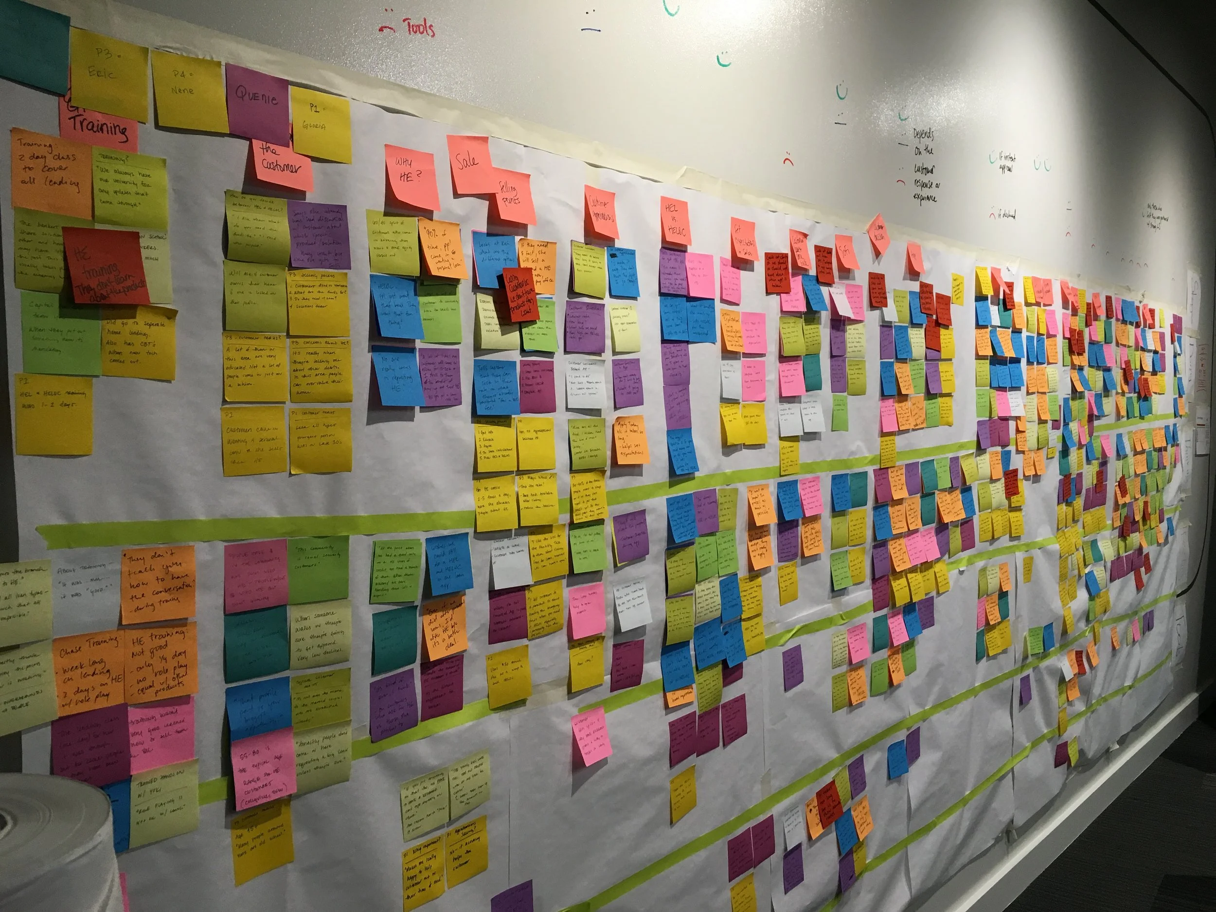
Home equity applications from physical bank branch locations were down, and customer complaints about the process were high. We determined conducting branch interviews and contextual inquiry (side-by-side) sessions would help us to determine why. I conducted research with 14 employees across 3 states to determine next steps.
Findings
Inconsistent loan process and underwriting communication led to duplicative document requests and client frustration.
The existing application, tailored for mortgages, did not meet the needs of home equity customers, resulting in low-quality applications.
Branch employees felt inadequately trained to sell complex home equity products, and often deferred to simpler options like credit cards.
Next steps
I collaborated with our cross-functional team to analyze findings and to build a shared understanding of user needs across roles. Using the analysis I created personas and journey maps for in-branch employees, highlighting their home equity processes and pain points.
Using the research outputs, Capital One decided to remove home equity from in-branch product offerings. Instead, home equity clients were directed to a specialist hotline, which freed up bankers to support clients with other tasks.
Our new direction
Now that in-branch employees had been removed from the home equity process, we changed our direction to an online consumer facing home equity application.
Exploratory consumer research
The challenge
We inherited a mortgage application and were asked to transition it to home equity clients, but were unaware of home equity needs. I conducted in-person interviews with home equity consumers to understand their motivations, fears, and application processes to inform the application changes.
Findings
Users lacked understanding of home equity and its utilization.
Users sought an easy application process with auto-populated information.
Users were hesitant to provide personal information until they were sure about proceeding with a lender.
Next steps
Using the findings we began wireframing and designing the application.

“What makes me nervous about going online is getting overwhelmed with real estate jargon I don’t understand.”
Design & validate
The approach
Using our foundational research we collaborated with our product and engineering teams to create user flows and designs of the application. I conducted two rounds of in-person moderated usability tests with home equity consumers of the designs and we iterated rapidly between.
Findings
Users wanted assurance of information security.
There was an inherent trust in Capital One's offerings, but the options needed education and simplification.
Users were overwhelmed by long forms, and instead preferred the application to be automated and broken into smaller question sets.
Impact
The new design was a great success with significant reduction in application drop-off leading to three times application conversion.
In the following months we continued to adjust the experience. Including adding more education and a soft credit pull.
Three months post launch we won an award from McKinsey & Company for usability.